CampX
A university platform, taught to run a school.
Selected work
CampX had a university platform and a K-12 market it could not serve with it. Almanac is the school product built on that core, with the primitives a school needs and a college does not.
Visit CampXBuilt by Pivot & Anchor, a design and engineering studio.CampX runs campus operations for colleges and universities. Schools kept asking for it, and the honest answer was that the product could not serve them: a K-12 school is not a small university, and the difference is in the data model rather than the labels.
We audited every capability against one question. Can this ship with a rename and a reskin, or does the underlying model force a rebuild? Most of it reused. What did not traced back to two primitives that a higher-ed system has no reason to have: the guardian as a first-class person, linked one-to-many across siblings, and the persistent section owned by a class teacher. Those two absences cascade into report cards, daily attendance, family billing, parent communication, substitution and PTM.
Almanac is the K-12 product built on that finding. What has landed so far is the foundation and the opening of the work above it: the guardian and family graph, class teacher and homeroom, the school grade and term structure, the daily attendance engine, the class diary, co-scholastic assessment and the parent persona. Each of those arrived as a matched set, from the migration and the entity through the service, the gateway route, the permission and the shell to the screen. It is additive and tenant-gated, never a remodel, so the college product stays provably untouched.
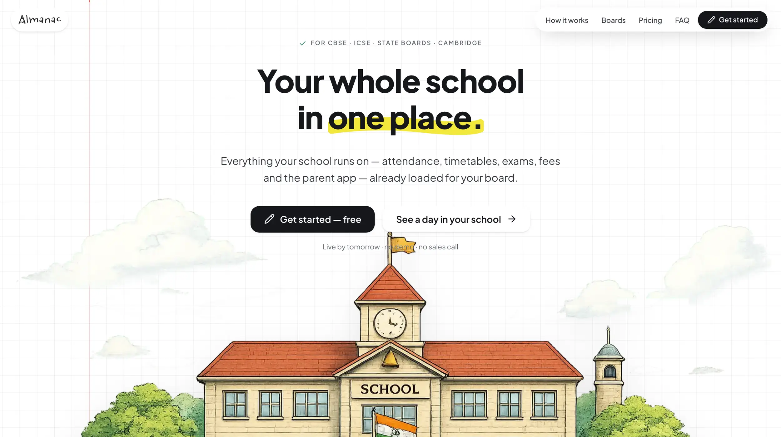
Two other things came out of the engagement and both outlived the brief. We wrote the design system the products share, which is the largest single thing we did here: the whole token layer, the generation and verification scripts that keep it honest, and the documentation a new brand is added from. Three brands run on it today, and the third is the point. CampX takes on a customer, the components change colour, and the customer gets a product that looks like theirs without anybody forking the code. A design system that only serves its owner is a style guide. This one is how they onboard a client.
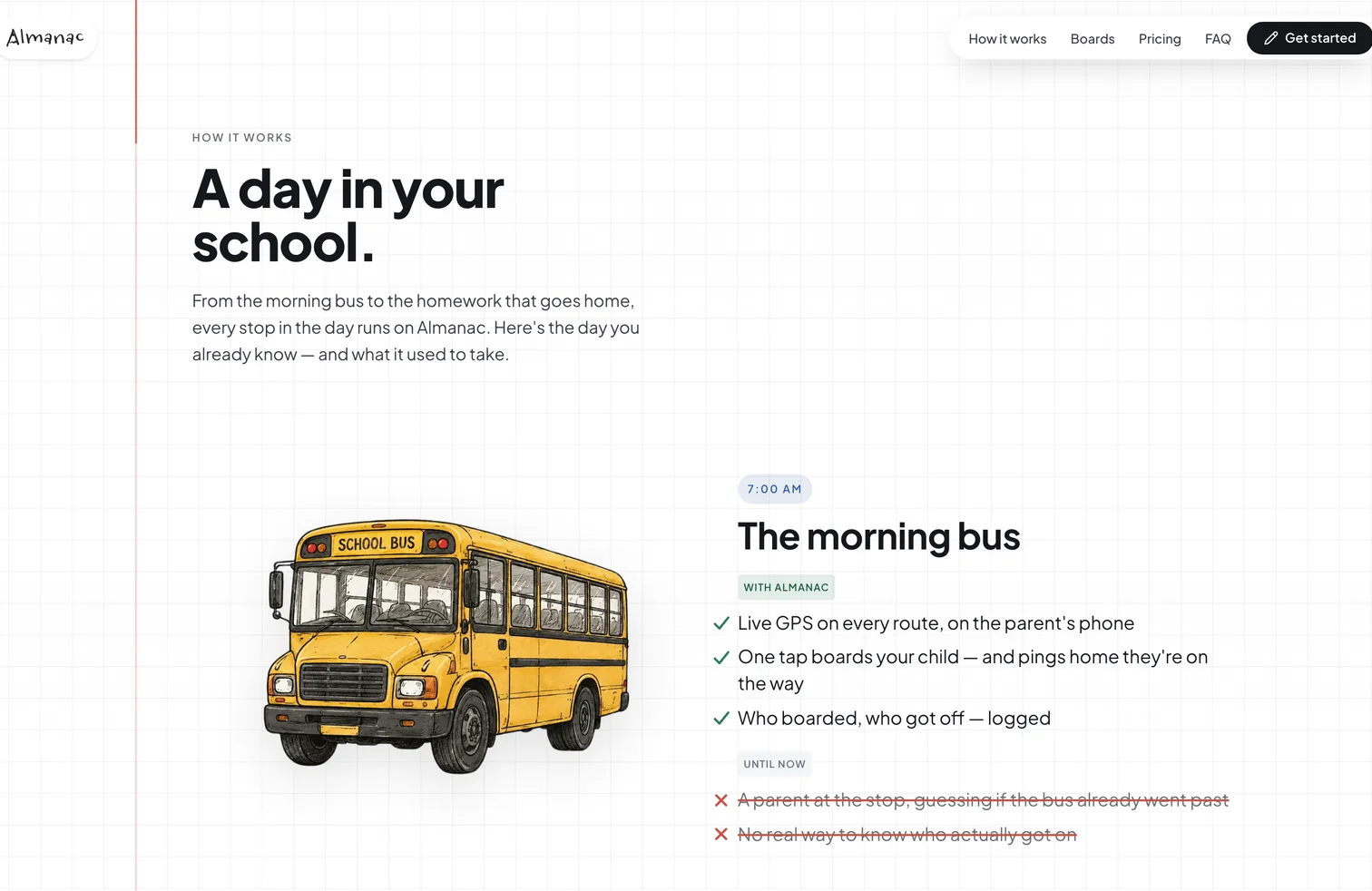
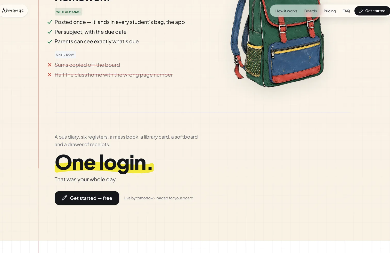
The product site is ours too. A school buying software is normally asked to sit through a demo and imagine its own building into a feature list. This shows a day it already recognises, from the morning bus to the homework that goes home, and puts what each moment takes now beside what it took before.
We came to Pivot & Anchor with a school ERP that needed to look and feel like a product schools would sign up for on their own, not something that needed a sales call to explain. They understood that distinction immediately. What we got back was a design language and a product surface that genuinely raised the bar for us — and a team that behaved like an extension of ours rather than a vendor waiting on a brief. Spruha and Sai are unusually direct about what will and won't work, which saved us months of second-guessing.
What stood out was the consistency. Every screen came out of the same system — same components, same patterns — so nothing needed to be untangled later. Their pace is genuinely fast, but it's not the kind of fast that leaves you with a mess to clean up afterwards. They ask the right questions before writing anything, and when we pushed back on technical decisions, the conversation was substantive rather than defensive. Handing work to them didn't create work for my team.
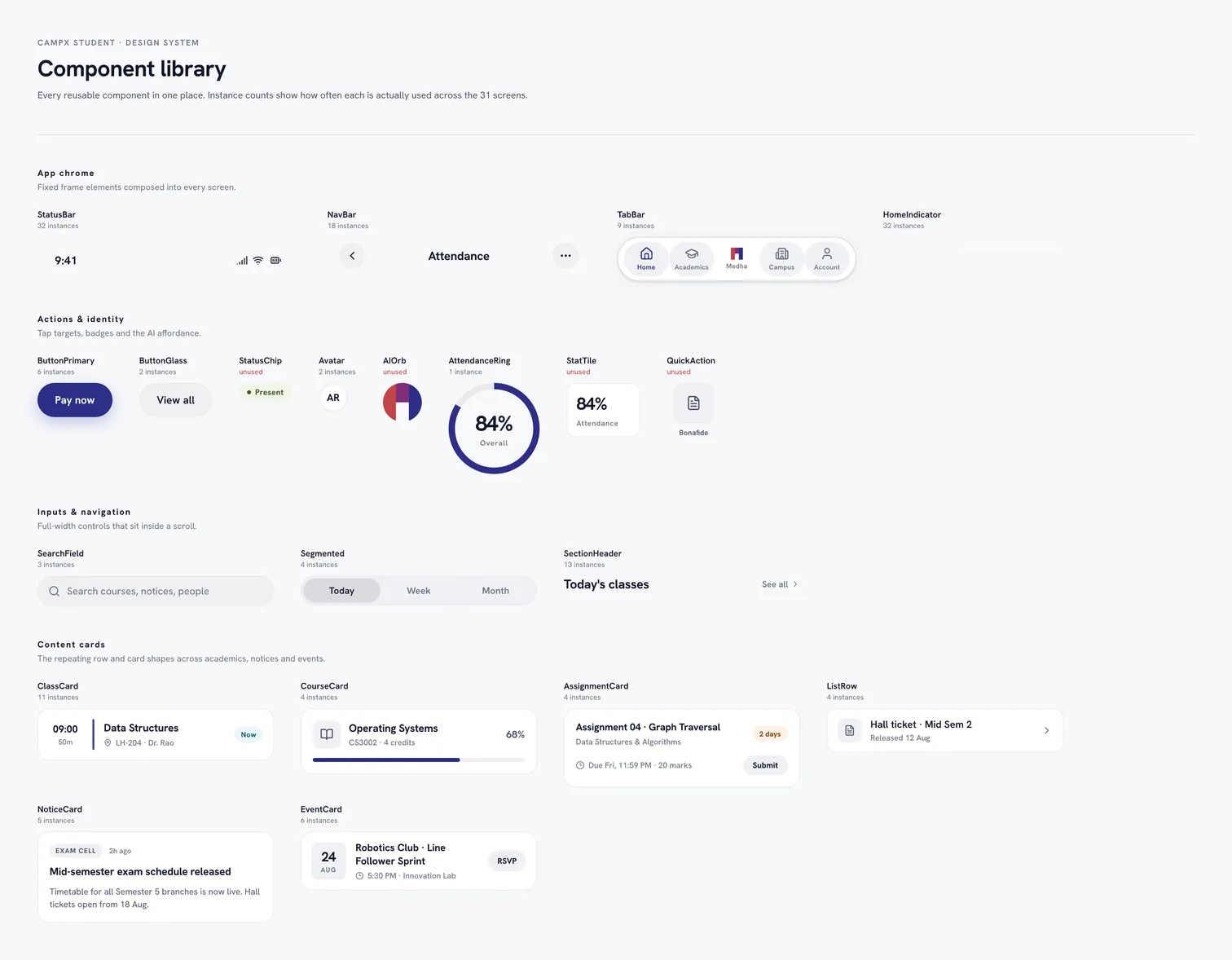
Almanac, the product site

01 — The product promise
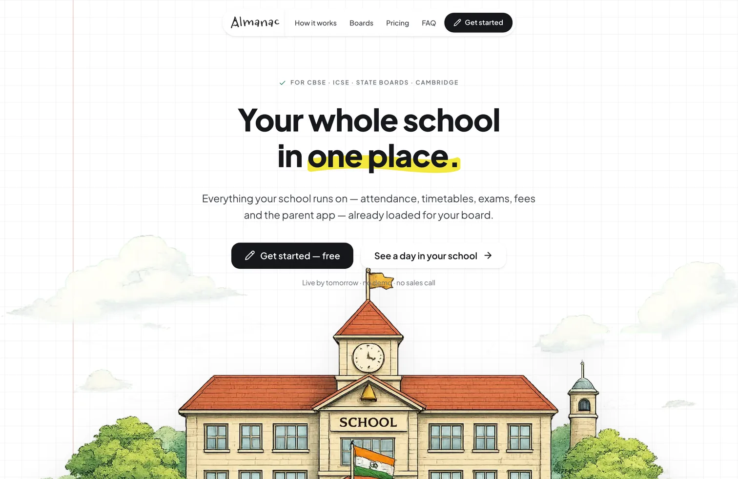
Your whole school in one place
This is the self-serve front door Almanac is being built toward. The product remains in delivery; the site makes the intended experience concrete now: attendance, timetables, exams, fees and the parent app, already shaped around the board a school teaches.
02 — A day in your school
Show the day, do not list the features
A feature list asks a head teacher to imagine their own school into it. This walks a day they already recognise, from the morning bus to the homework that goes home, and sets what each stop takes now against what it used to.
03 — Report cards
Assembled from marks already in the system
Grades entered through the term compile into a board-ready report card. This is the step that used to consume a fortnight of teacher evenings, and it is the clearest case of why the data model had to change rather than the labels.
04 — Pricing
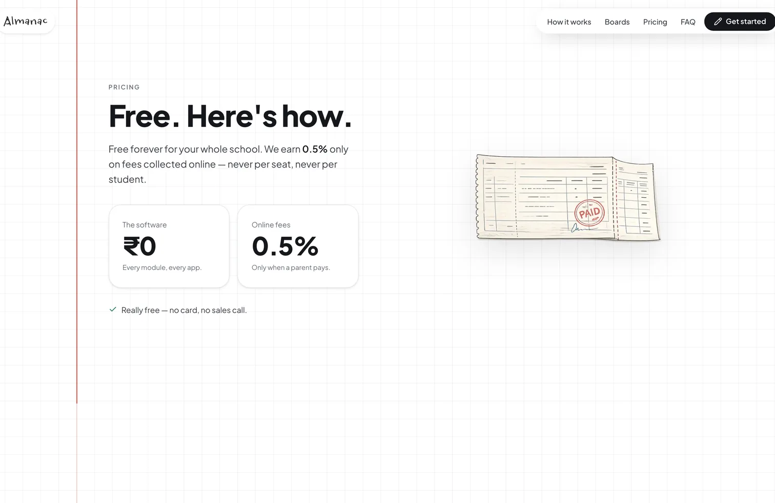
Free, and honest about how
The software is free for the whole school, every module and every app. The business earns half a percent when a parent chooses to pay fees online, and nothing otherwise. Saying so plainly, on the page, is the point.
The student app

01 — The whole degree
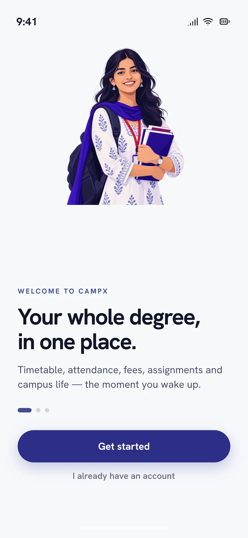
One app instead of six portals
A student's timetable, attendance, subjects, assignments and fees had lived in separate places. The app opens by saying what it replaces.
02 — Coursework
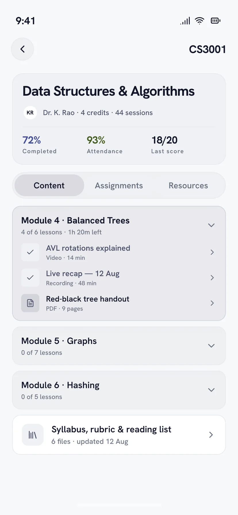
A subject, module by module
Lessons, recordings and handouts sit inside the module they belong to, with progress carried at the top. A student can see where they stopped without reading a list of files.
03 — Assessment
The test, taken on the phone
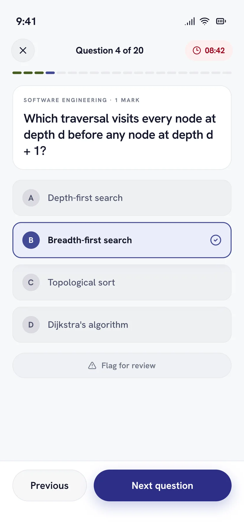
A timed quiz with the clock, the question count and a flag for review, all on one screen. Nothing here opens a browser.
04 — The office
Requests you can watch move
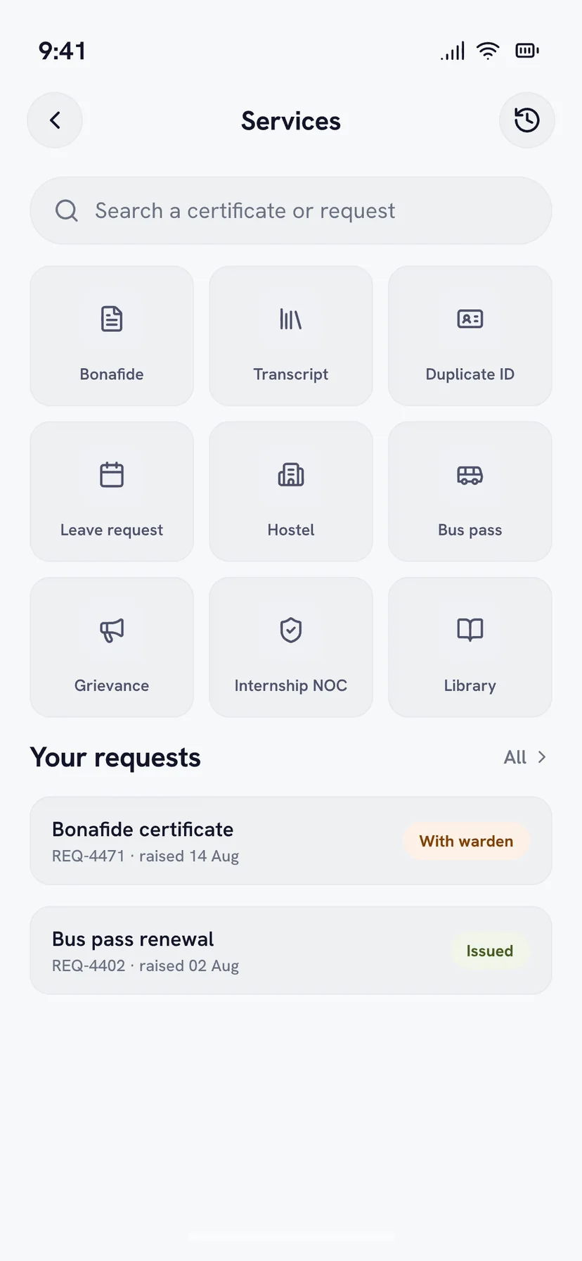
A bonafide certificate, a bus pass, a transcript. Each request carries where it is right now, so nobody has to walk to a counter to ask.
Winnify, through the same engagement
01 — Through the CampX engagement
An app for someone else's product
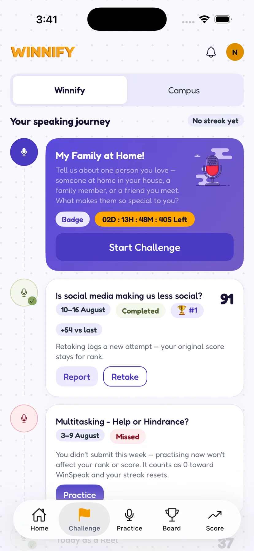
Winnify is not our client. CampX is. Winnify is a speaking-practice product built on CampX's platform, and CampX brought us in to build its phone app. Students get one speaking task a week and sixty seconds to answer it.
02 — The answer back
Feedback that quotes you
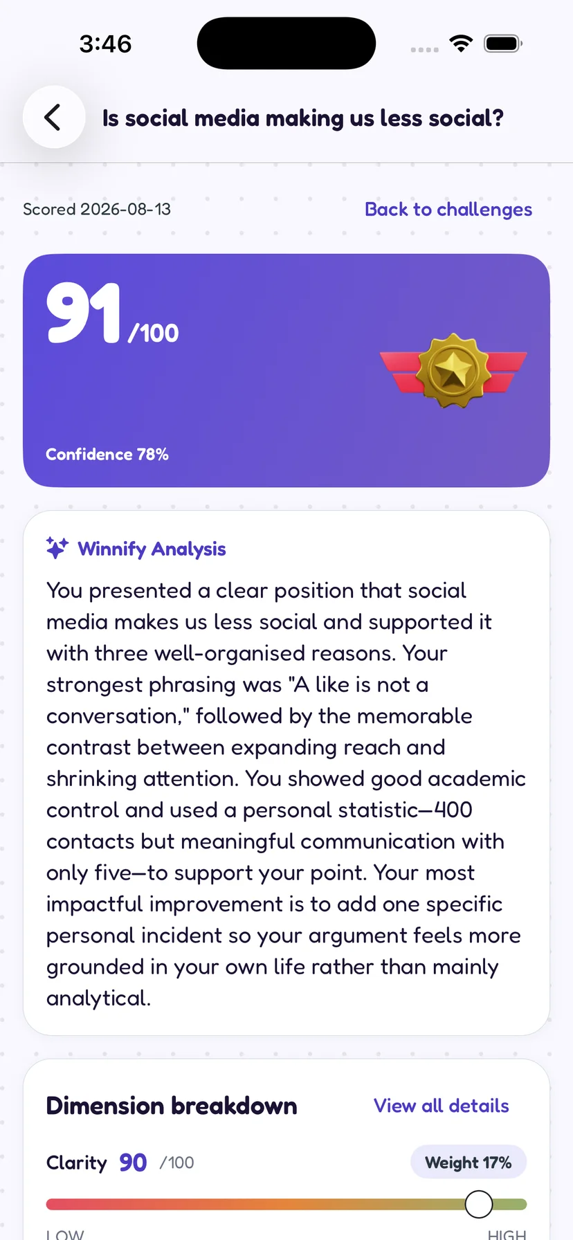
Sixty seconds of speech comes back as a score, a confidence figure and several paragraphs that cite the student's own phrasing and name the one change that would help most. Below it the score breaks into weighted dimensions, so the number is arguable rather than final.
03 — Off the record
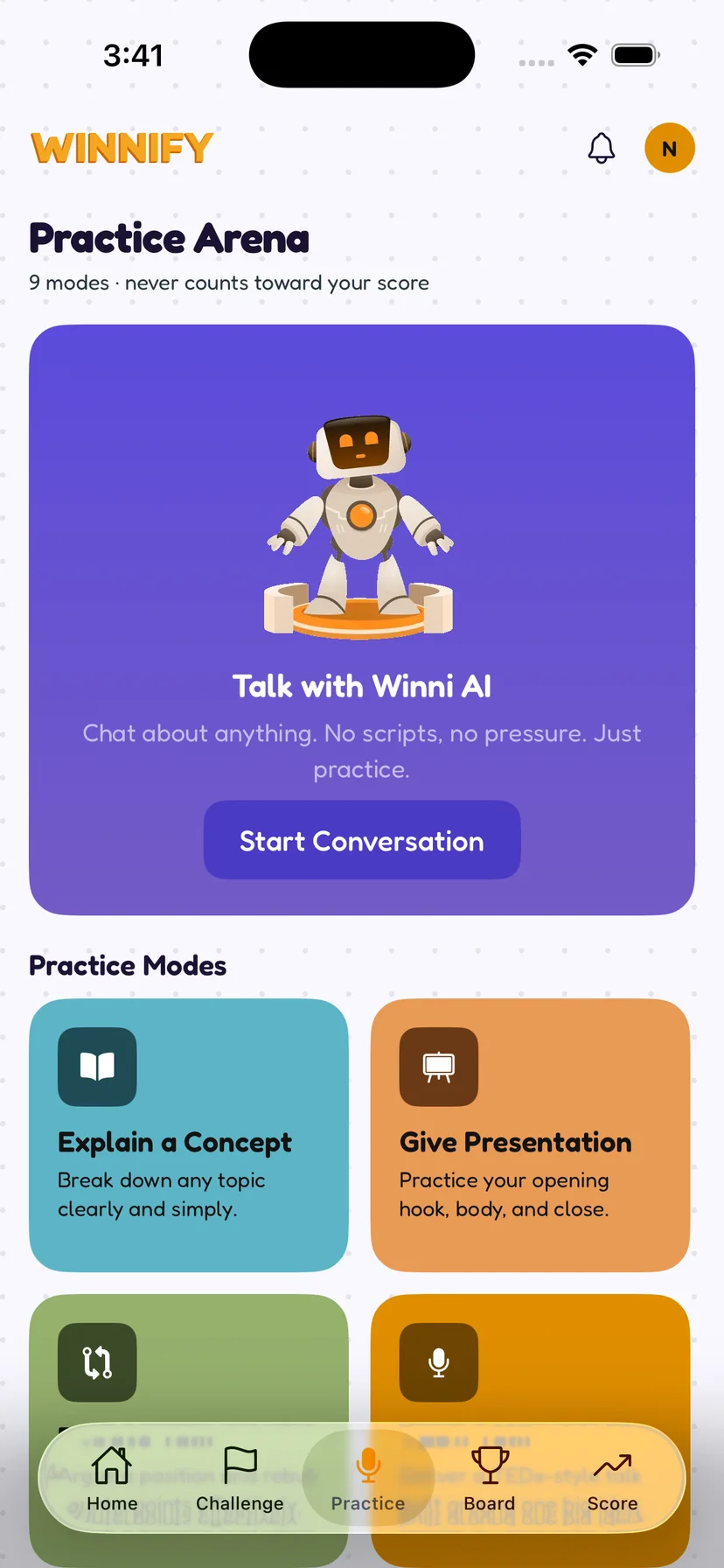
Nine ways to practise for nothing
Explaining a concept, opening a presentation, talking to the assistant about anything at all. None of it is scored and none of it counts, which is the whole point of having it.
04 — Over time
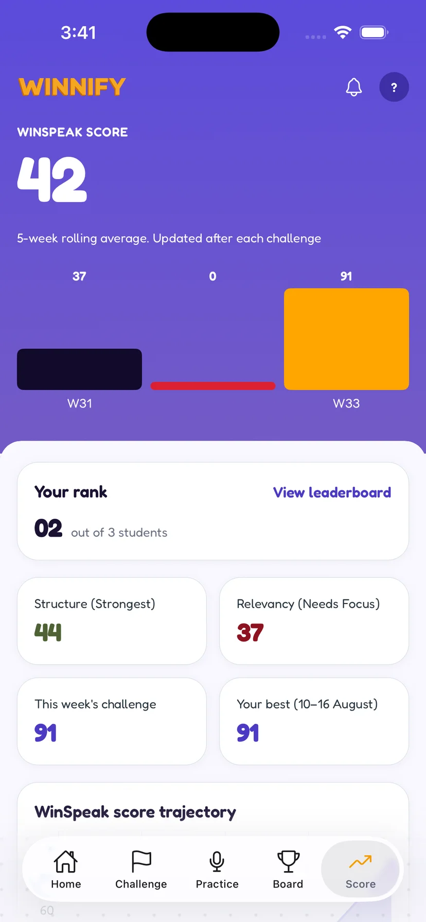
A five-week average, not a high score
One good week does not move the number much and one bad week does not sink it. The two weakest dimensions are named on the same screen.